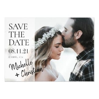
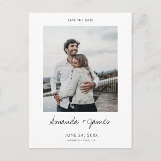
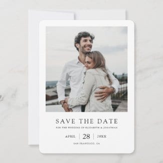
The process of choosing and customizing save the date cards that will garner raves can and should be a breeze! These simple save the date ideas will help to demystify things and show you how close you are to creating your own unique wedding invites.
Save the dates after all, are sent out on their own as a simple heads up well before formal invitations. And so whether you have your wedding theme worked out yet or not, you have the option of picking a save the date style that simply stands on its own.
That said, something that won’t obviously clash with your theme does make sense. And that could well be a big part of why a ‘less is more’ aesthetic for save the dates seems to have struck a chord.
As the wedding invite designers behind Goat Tree Designs on zazzle, we love doing a lot with a little and turning our save the date ideas into flat cards, postcards and magnets with a distinct, modern, minimalist flair.
Adding your names and key details along with in many cases your favorite photo is easy, and with that, voila! You’ve created an invitation that’s uniquely yours, and you can turn your attention to all those other sticky decisions you need to make between now and your ‘I do’s’!
Save the Date Options
In this article we want to show you some save the date examples let you know about some options that you can quickly and easily experiment with when you’re editing your cards, beyond the basics of replacing sample text and photos with your own.
And in no time at all thanks to zazzle’s intuitive design tools and range of choices, you can experiment with touches that can bring a design to life and make it a true reflection of your very own taste and style.
Though we’ll be referring specifically to zazzle here, similar options are often available on other platforms that offer custom wedding invitations, so read on for inspiration and ideas!
Consider these aspects of a save the date card’s appearance and have fun playing with those that matter to you most, keeping in mind that you can always easily go back to the design you started with!
Card Type
These are the save the date card types offered on zazzle and other websites, ranked in order of popularity in our own experience:
- postcards
- flat cards
- magnets
- folded cards
Postcards and flat cards account for the lion’s share of our sales, with magnetic cards coming in a distant third. Folded save the dates, well, let’s just say that our advice is to steer clear of them unless you see something that really grabs you and makes good use of its additional surfaces.
Save the dates are a fairly new tradition, and as such there’s more leeway with them than with a standard wedding invitation that provides more specifics. So folded cards are most often just too much here, and don’t evoke the free and easy spirit behind a save the date.
Save the Date Postcards
On the other hand, a postcard is perfectly fine in that it conveys its purpose succinctly-we’re tying the knot on this date in this city and we want you to be there, so please mark it on your calendar!
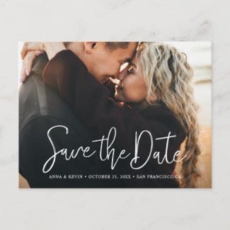
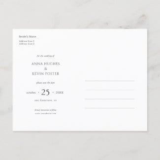
If you’re on a budget, postcard save the dates can be especially appealing in that you’ll likely save money on a couple counts. First, they’ll likely be cheaper to buy than other formats when you consider the price of the card itself, and also the savings of not needing an envelope.
Then you’ll save on postage, assuming you choose a design that’s standard postcard size and qualifies for that mailing rate.
The downside is that what you send might not be quite what people receive-postcards can get roughed up in transit and so if you want more control over such things, a flat card is definitely worth
considering, even if your first feeling nudges you in a simpler, cheaper, more casual direction.
Save the Date Flat Cards
We use a popular default size of 5″ x 7″ when we design our save the date flat cards, but zazzle offers other sizes as well. It just depends on the design as to whether you can easily adapt it to
different dimensions.
Flat cards are a great choice, especially if you have your heart set on a photo save the date. They give your picture a chance to really shine.
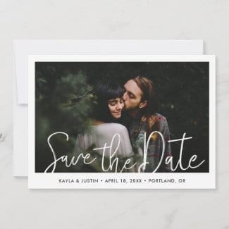
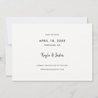
While cost is often a consideration that nudges people toward postcards instead, there’s another factor that sometimes steers folks away from this very worthy choice-Fear of Empty Space! Specifically, the space on back and what to do with it.
But really, this is easily taken care of, just as it is with a postcard. You can enter your basic details on the back with no worries about repeating info that’s on the front.
You might add something else, such as your wedding website info, etc., but there’s absolutely no need to fret about wording a message. So save your angst about all that for your thank you notes!
Save the Date Magnets
On the flip side there are magnets, namely because there is no flip side! The charm of a magnetic save the date card is its simplicity as well as its potential longevity. A photo magnet card will most often simply feature your names, date and wedding city.
They’re not the cheapest option, but especially if you have a photo that you just love and want to put out there, simple save the date magnets can be a fun, memorable way to announce your big day. And how can they not be memorable?
They’ll be gracing the fridges of your nearest and dearest for the months leading up to your big day, after all. And dare I say long after that, in some select cases.
This brings me to a creative option-if you’re not quite sold on the idea of sending a magnet to everyone on your list but are intrigued, you can always go with postcards or flat cards, with a twist.
That is, embellish that with a small order of magnetic cards bound for your most familiar fridges, such as the ones that belong to your parents and grandparents! They’ll be delighted by the extra thought, and you might even have the chance to give the magnets to some of them in person.
Photo magnets are a save the date idea that has the power to delight because they’re not something that is expected or often seen, so they can be a fun way to make a splash.
Shape
The usual, expected style is sharp corners, but flat cards give you the option of experimenting and you can quite easily check to see if another look might grab you instead!
In fact, a real sleeper hit for us has been the rounded corner look. Because the basic shape and size remain unchanged, you can often adapt a design to this look with a simple click, with all of the elements still visible.
The extent to which this style has caught on was a bit of a surprise to us. Full photo designs are an obvious candidate for this softer look, but it turns out that even modern minimalist cards with a sharp white border around a photo work well with corners that are not crisp!
The two save the date flat cards below show how both sharp and rounded corners can work well with a modern photo-centric design, as well as other styles. Zazzle gives you the option of choosing either look for these designs from our shop.
So if you choose zazzle or another site that offers this option, it’s worth playing with this look as you edit your card. It can lend a feeling of warmth to minimalist designs, and set your design apart
from the standard.
Generally, one of these two looks will be your best bet. But depending on your card’s design and the sense you want to convey, the ticket, scalloped or bracket look might be a good fit.
We mean that in the literal as well as the aesthetic sense, because many designs simply won’t won’t work with these other shapes, in that parts of the design will be cut off, etc.
But if one of these alternative shapes happens to strike you and your design of choice can adapt to it well if it doesn’t already in fact feature such a shape as the default look, it will certainly give your
cards a memorable, road less traveled flair!
Font
When it comes to fonts, especially with save the dates, you might well find that your favorite design is good to go just as it is, and as designers we strive to create cards like this!
But we recognize that once in a while someone will love a design but wish they could tweak the look just a bit-maybe the handwriting font shown is a bit too casual, or formal, for example.
When it comes to the font used for your personal details on zazzle as well as many other sites, you can certainly experiment with other typography from their selection.
Just be prepared for different fonts to take up different amounts of space in the design, so you might need to also play with the font size to get back to a balanced look that fits within the design parameters.
If you have trouble or doubts in this process, take advantage of zazzle’s chat feature by clicking on the speech bubble icon near the top of zazzle pages. You can directly contact the designer in question and request help in turning your save the date ideas into reality!
From personal experience we can tell you that we love to connect with folks who are interested in our designs and it’s especially satisfying for us to know that we helped someone to get just the look they were after!
Beyond the text on a card that is meant to be customized, depending on the design you might not be able to alter some text. In our own designs for example, we sometimes use our own fonts for prominent elements like the ‘Save the Date’ text that are not part of zazzle’s typography lineup.
These are images of text that we insert into the layout rather than actually typing the text as we would with a readily available font already in the system, and so the buyer can’t edit them for style,
color, etc.
Zazzle offers a big selection of fonts, to the extent that you can really get lost in them if you let yourself. The ‘script’ and ‘handwriting + calligraphy’ categories are good places to focus your
attention, as they contain many of the fonts that are often used for key parts of wedding invite designs that really stand out, such as your names, etc.
Color
Don’t assume that a given save the date template limits you to the text and background colors shown. In our zazzle designs, for example, as with font style, if the text is not a special image we have uploaded but is one of the texts in zazzle’s selection, you can change the color!
So, as with the font, any text you need to edit for your own details surely falls into this category, and often other text does, as well, depending on the design. Backgrounds are also often changeable.
So the question is, what’s the easiest way to tweak the colors? When we started designing on zazzle we went through the process of figuring this out from scratch and found that it’s a breeze if you know what the system offers and have a decent idea about what you want.
On the most basic level of color picking, after you click on ‘personalize this template’ click again on ‘click to customize further’ and you can then view the default color of a given design
element.
Click on that color and you’ll see a grid of colored squares in various basic tones-currently zazzle shows 35 of these. If one of these colors happens to be what you want for a certain piece of text
or background, just click on it to see how it looks.
You can always click the undo arrow icon, so don’t worry, this is the time to play with things!
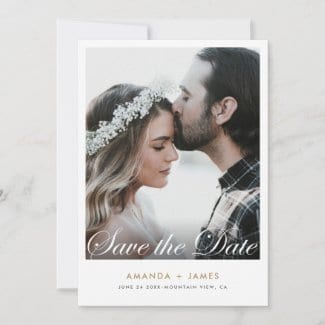
The design below is one of our most popular, and simply changing the color of the names text is an easy way to incorporate a key color from your theme or to simply highlight this part of the design.
And although gold, black and gray tones are most often used, you might prefer a color that references a season or a tone that you simply love!

If the colors in zazzle’s basic grid don’t grab you, click ‘custom color picker’ below that.
Here’s the part that I really want to highlight! Your next logical step might well be to click ‘custom color picker’ below the color grid, and a color spectrum will appear.
But rather than doing that and trying to use your cursor to conjure colors there, head over to color-hex.com.
This site is loaded with colors and corresponding numbers that you can enter into the zazzle system, and if you’re using another platform, it may well have this option, too.
This site itself can be overwhelming, given all the choices. So now that you know it’s there, do a general internet search for ‘hex number’ and include the color you have in mind in that search phrase. Then, rather than having to wade through all the possibilities on hex.com, you’ll cut right to the chase.
Take some numbers back to the card you have in mind and pop them in when you’re in editing mode and see what suits your style.
Keeping these things in mind, you can focus in on the elements that mean the most to you, and you won’t have to settle for something good but not quite what you would have ideally wanted.
Affordable Save the Dates That Don’t Look Cheap
Affordable save the dates that look great and are uniquely yours are just a matter of choosing a user friendly platform like zazzle and knowing your options. And we hope the save the date ideas we’ve mentioned here help you to choose and personalize your save the date invites no matter where you buy them.
If you do see something in our shop that catches your eye and would like our help in customizing it or have any questions about anything, please don’t hesitate to use zazzle’s chat feature-we’re always thrilled to be of help!
